
inTouch® is CPI Security's branded mobile app, built on Alarm.com's platform. Alarm.com powers the cameras and smart home hardware CPI sells, and licenses the same core app to other providers under their own brands. That ownership split is the whole story of this project.
CPI cannot redesign the core app. Any structural change to the shell would ripple out to every other company running on the same platform. But the "My Account" area is a CPI-controlled experience nested inside that shell, and that piece we could shape. The work was figuring out how far a nested, deep-linked experience could go toward fixing problems the shell itself created.
Alarm.com owns the core app architecture, not CPI. A full redesign was never on the table.
The nesting problem was the biggest constraint, not a footnote. Every solution had to live inside a shell we did not control and could not restructure.
Deep linking was the only real lever. CPI-controlled pages had to be surfaced through labeled entry points instead of app-level navigation changes.
IT and platform dependencies gated everything. Conditional UI, Salesforce flows, and Agentforce integration all required cross-team validation before design could commit.
Business Impact
Every customer who cannot find billing is a support call, and that is a cost CPI was already paying. Search behavior showed users typing full sentences meant for a technician ("is my tech arriving soon," "where are you," "I want to cancel") because no other path existed. Short dwell times on the Contact Support screen (24 seconds) told the same story: people landed, did not find an answer, and picked up the phone.
This surfaced a harder tension. Chat is tied to EBITDA, so some of the friction I was trying to remove was also feeding a metric the business is measured on. That forced an honest conversation about what we were actually optimizing for. Reducing contact volume looks good on a support-cost line, but if the underlying need is a user who cannot find their tech's ETA, the real fix is answering the question, not preserving the channel that profits from the confusion.
* Old "My Account" Landing Page

Native Fidelity
Because the "My Account" experience is deep-linked into the inTouch® shell, it renders on both iOS and Android inside the same host app. That shaped the interface decisions before any single screen got designed.
Matching the native system, for seamlessness and accessibility.
One early decision shaped everything downstream: I matched the inTouch® app's native type system (SF Pro on iOS, Roboto on Android) rather than importing CPI's marketing brand beyond logo and color. That did two things. First, it kept the seam invisible. Using the same type and components as the shell around them, the deep-linked pages read as one continuous native app, so users never registered that they had crossed from the native shell into a web view. Second, it inherited accessibility. The Alarm.com platform inTouch® is built on is a shipped product used by many security providers, already built to ADA-compliant standards including accessible type sizing and platform-native components, so building on its UI library meant the nested experience inherited that compliance instead of re-solving it from scratch and probably breaking it.
I did not treat that inheritance as a free pass. I ran WCAG validation on my frames in Figma before every handoff to the dev team, triple-checking contrast and sizing so nothing slipped through between design and build. Conforming to the host system kept the pages native and compliant by default; validating each frame kept them that way in practice.
Platform-agnostic components. The experience had to read as native on both operating systems without maintaining two divergent designs, so I matched the existing patterns of the shell rather than importing a separate visual language.
Concise, mobile-first CTAs. Short action labels ("Switch," "Manage," "View") were deliberate. A longer label like "Switch Location" would wrap or crowd the button on smaller screens, and terse verbs are the standard for secondary actions in a card. The surrounding context (a card already showing name and address) does the disambiguation, so the button does not have to.
Performance budgets that matched native expectations. UI transitions were held to the shell's own patterns: under three seconds for a location switch, under one second for a drop-down, so the nested pages never felt slower than the app around them.
Residential and commercial paths. Commercial customers see a payments-portal-first view with a site switcher, since their needs and permissions differ from residential users. The same nested architecture flexed to serve both.
Approach
01.
Formal usability testing was deprioritized by leadership for phase one. Rather than stall, I grounded every prioritization decision in behavioral analytics pulled from GA4, so the roadmap was driven by what users actually did inside the app, not by whose opinion was loudest in the room.
I pulled screen-level data across the app (views, active users, views per user, and average engagement time) and used it to build a tiered priority order.
Tier 1, build first:
Billing. Payments is the #2 screen in the app at 48,663 views with a 43-second average engagement. High volume, high intent.
Support and FAQ. Contact Support (9,511 views) and FAQ (9,129 views) show users actively trying to self-serve. Every screen that fails here becomes a phone call.
FAQ and Article Detail together draw roughly 25,600 views, with a 54-second read time on Topic Detail. Users are genuinely reading, so this had to be built well.
Referral. 5,359 views at 43-second engagement. High-intent and revenue-adjacent. An easy win.
Tier 2:
Contacts and codewords, the Moving page (low volume but a high-stakes churn moment), insurance certification.
Tier 3, deprioritized:
Scenes, arming, and system-notification tips. Low view counts confirmed these should not block the sprint.
One number I deliberately did not lean on: the Appointment Assist screen showed 27,179 views against only 18 active users, roughly 1,500 views per user. That is not normal usage. I flagged it as a likely tracking artifact (a bot, a test script, or a redirect loop) and pulled it out of the impact case rather than citing an inflated figure. Real usage or not, that ratio would have skewed any post-launch measurement, so it became a thing to fix, not a stat to celebrate.
Strategic Solutions
01.
The Problem
CPI had real functionality (billing, referrals, contacts, appointment help) sitting behind a shell it could not restructure. Users had no labeled path to any of it.
The Solution
Rather than fight the platform, I designed CPI-controlled pages and used deep linking to surface them from inside the shell. Each high-value task got a labeled entry point that routed straight to the right destination, including flows that already existed in the third-party environment (like Appointment Assist) but had no discoverable path.
Key Features
A prioritized set of deep-link destinations mapped to real business value: Make a Payment, Update Payment Info, Referral Creation, FAQ / Troubleshooting, Users Management, and Schedule a Service.
Entry points ordered by actual traffic and intent, not by internal org structure.
Routing that reused existing platform flows wherever possible, keeping engineering lift low.
Impact: Deep linking let CPI ship a materially better account experience without touching Alarm.com's core code, turning a hard constraint into a repeatable pattern for surfacing future functionality.

* proposed Modules
02.
The Problem
Billing was the top reason people opened "My Account", but the plan on the table was to drop a Pay Now button into a screen already crowded with similar-looking rows. A button says "go pay something." It would have gotten lost, generated a click number to report, and moved neither support volume nor on-time payments. The stronger fix, surfacing the live balance itself, carried IT and business dependencies that were not ready, and the product needed to ship.
The Solution
I designed the end-goal experience and sequenced it into two phases, so we could deliver value immediately and build toward the ideal as the dependencies cleared.
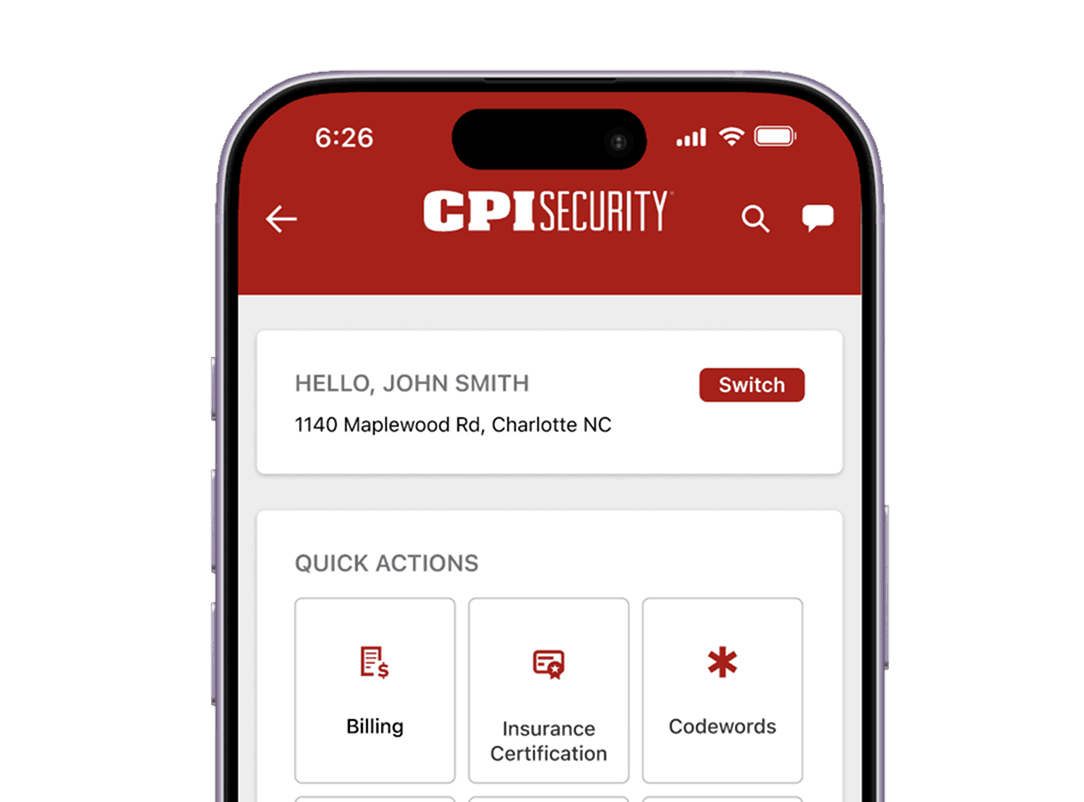
Phase 1, shipping now: a Billing entry in the Quick Actions grid. A lower-lift, clearly labeled path that gets users to billing directly instead of hunting for it, achievable without the deeper integration.
Phase 2, the end goal: a balance-first card at the top of My Account. The moment a user lands, they see the actual balance due, the due date, and autopay status, with Pay My Bill and Billing & History right there. "You owe $X, due [date]" is where the conversion lift lives, not a generic button. Phase 2 is pending IT logistics and business constraints. The design is done and ready to ship when they clear.

* phase 2 end-goal, not yet shipped
Key Features
End-goal balance card: outstanding balance, due date, and autopay status surfaced at the top of the screen.
One clear Pay My Bill CTA tied to that balance, with Billing & History alongside.
Phase 1 Billing tile in Quick Actions as the immediate labeled path while the balance integration is built.
Impact: The phased approach ships a real improvement now without waiting on dependencies, while locking in a clear path to the end-goal balance-first screen. Both phases target the same KPIs: on-time payment and support-call deflection.
03.
The Problem
The entry point to "My Account" lived in a platform menu CPI did not control, sitting alongside two near-identical labels: "Account" and "Account Management". The most important destination carried the most generic name. In review we had to draw a box around it just to point it out. Because that menu belongs to the Alarm.com shell, renaming or reordering it was not something CPI could do on its own.
The Solution
I raised the taxonomy problem as a formal callout. It was not prioritized for this phase, and since the menu lives in the third-party shell, it stayed unchanged. So I put the IA work where I actually had control: inside "My Account". Once a user clicks through, everything is organized into a priority-ordered Quick Actions grid, so the highest-traffic tasks are immediately visible instead of buried in a list.
Key Features
Priority-ordered Quick Actions grid surfacing the most-used tasks first (Billing, Insurance Certification, Codewords, FAQs).
Related tasks grouped together instead of scattered as loose rows.
A documented callout of the shell-level taxonomy issue for future platform decisions.
Impact: Even without the ability to change the shell's naming, the redesign made the destination itself immediately navigable, attacking the "can't find it, so I call" pattern at the point CPI could control.

04.
The Problem
The sharpest finding in the data was not on the account screens at all. Search showed 20,748 views at a 36-second engagement time, and the queries were almost entirely appointment conversations: "is my tech arriving soon," "where are you," "track technician," "when will Teo be here," "need to reschedule," "I want to cancel." Users were trying to talk to a technician through a search box because they had no other path.
The Solution
I surfaced appointment status where the friction actually was. Even though Appointment Assist lives elsewhere in the shell, "My Account" was the right place to resurface it, and like billing I designed it in two phases.
Phase 1, shipping now: a contextual Appointment Status Card at the top of "My Account". It renders only when the customer has an active or upcoming appointment and hides when they do not, so it is conditional real estate, not a permanent fixture. It shows the appointment date, the arrival window, and a Manage appointment action.

* phase 1, shipping now
Phase 2, the end goal: an Add to Calendar action on the card. This one is as much emotional as functional. Customers waiting on a technician worry about missing the window, and letting them drop the appointment into their own iOS or Android calendar puts that worry to rest. They know it is saved and that their own device will remind them. The functionality depends on IT work in progress, so it is sequenced for phase 2 while phase 1 ships the status and manage actions now.

* phase 2 end goal, pending constraints
Key Features
Conditional card logic tied to real appointment state, with a red left-aligned status bar.
Appointment date, arrival window, and Manage appointment surfaced up front (phase 1).
Add to Calendar planned for phase 2, pending IT functionality.
A proposed integration path to the existing Agentforce appointment-update experience so customers could get tech ETA without leaving the portal.
Impact: This reframed the account redesign around the app's real highest-friction moment. It is the difference between designing for what the screen is named and designing for what users are actually trying to do.
The redesign is currently in UAT, so measured results are pending. What follows is the target frame the work was built against.
Reduced support-call volume from customers who currently call because they cannot find billing or appointment status.
Higher on-time payment rate from the balance-first billing module.
Increased self-serve completion on FAQ, referral, and contact tasks.

Secured leadership alignment on shipping the balance-first version of Pay Now rather than a button that would have moved a vanity metric.
Aligned IT, inside sales, and analytics around a single deep-linking approach and a data-driven build order.
Reframed the project internally from "add a payment button" to "fix the information architecture debt in the same launch, at the same scope."