CPI Security, a prominent home security provider serving the Southeast since 1991, faced critical website performance and usability issues that directly impacted their ability to convert visitors into customers. The existing site suffered from severe technical debt and poor user experience.
12-second page load time creating significant user abandonment
45+ WordPress plugins causing conflicts and instability
Outdated WordPress & Divi versions creating security vulnerabilities
Poor mobile responsiveness across devices
Inconsistent design system with no unified visual language

Business Impact
CPI Security's outdated website directly hindered business growth. Slow 12-second load times drove visitors away before pages even loaded, while confusing navigation prevented users from exploring products and building trust in the digital experience. The site prioritized aggressive "call now" CTAs without clearly communicating the company's differentiators, value propositions, or service offerings in a professional, visually compelling way. Inconsistent lead capture forms created friction at critical conversion points, and the bloated site structure resulted in poor search visibility. These challenges prevented CPI Security from competing effectively in the digital marketplace and capitalizing on qualified leads.
Strategic Solutions
01.
The Problem
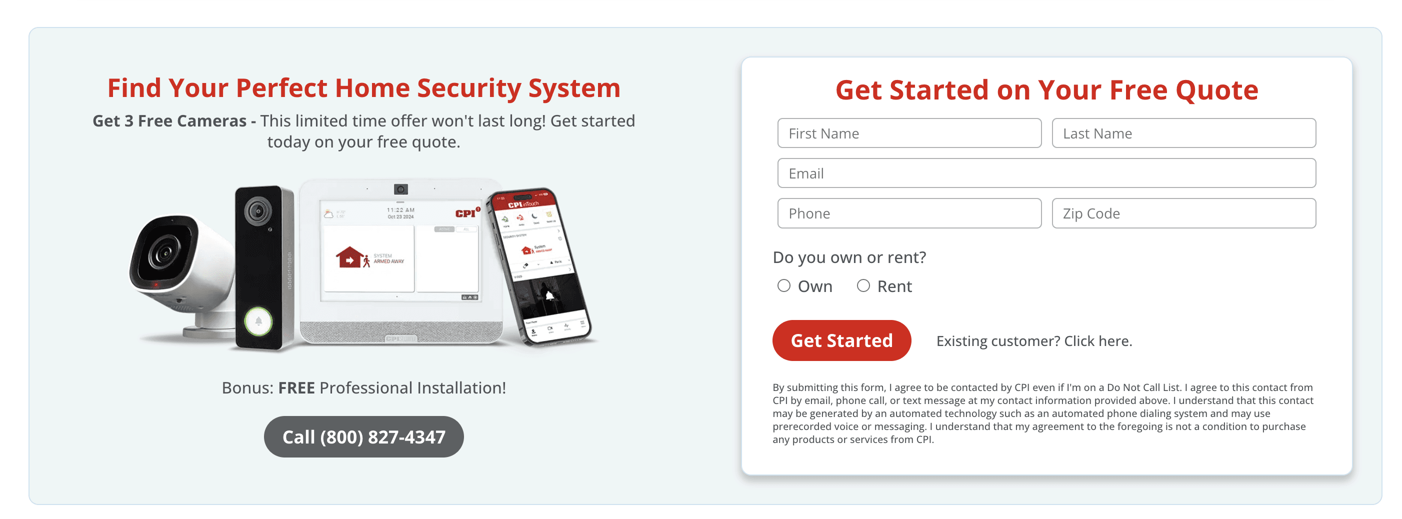
The existing lead capture system had critical gaps. A residential form appeared on the homepage and throughout most pages, while a separate commercial form only appeared on commercial-specific pages. This created two key problems:
First, it prevented cross-selling opportunities. Customers who own both homes and businesses might only encounter one form type, never realizing we serve both sectors. Second, many business inquiries were submitted through the residential form simply because that's what visitors encountered first. The sales team couldn't distinguish between homeowner and business inquiries, leading to misrouted leads, wasted resources, and poor conversion rates.

The Solution
Designing a universal intake form that adapts based on user type, capturing the right information to qualify leads effectively while maintaining a streamlined user experience. Working closely with the IT department, I ensured the form integrated seamlessly with Salesforce and aligned with existing lead categorization used by the Inside-Sales Team, while following Nielsen Norman Group best practices for form design.
Key Features
Universal presence with smart exposure: Form appears on every page, allowing users exploring residential content to discover commercial offerings and vice versa, increasing cross-sell opportunities
Future-focused data capture: Includes options for services not currently offered (like renters), building a qualified lead list for potential product expansion based on actual market demand
Strategic field design: Each form field was carefully crafted using Nielsen Norman UX best practices and strategic UX writing to reduce cognitive load and increase completion rates
Intelligent conditional logic: Routes B2C vs B2B inquiries appropriately while capturing the right qualifying information for sales team follow-up
Mobile-first input optimization: Designed specifically for the mobile-majority user base with touch-friendly controls and appropriate keyboard types

Impact: 300% increase in commercial sales leads
02.
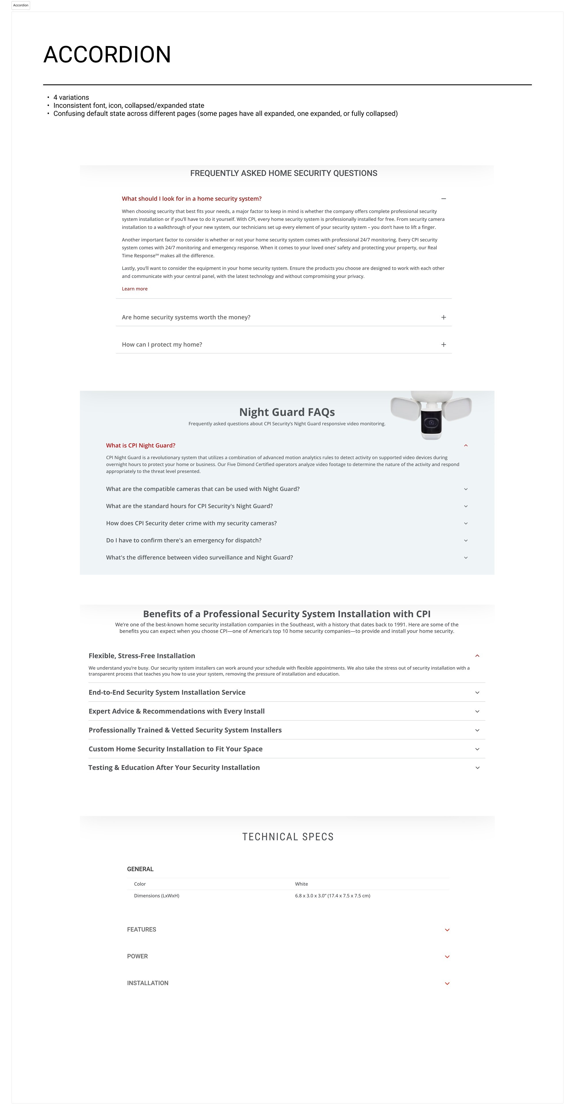
The Problem
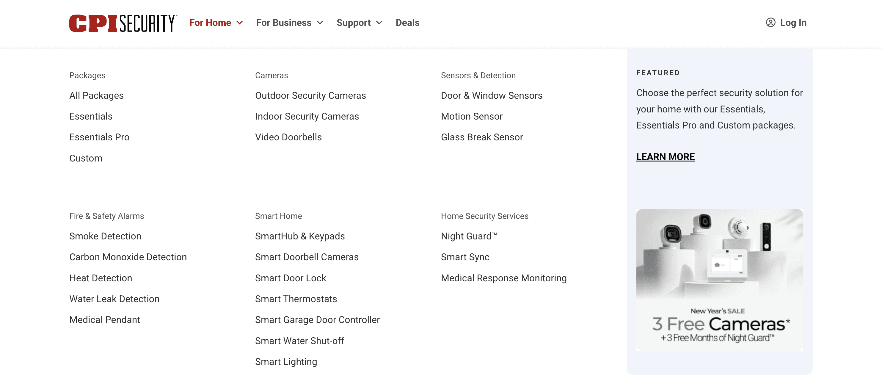
400+ pages accumulated from years of "just create another page" requests created confusing navigation with no distinction between residential and commercial services. Users couldn't find relevant information, and the structure reflected internal organizational thinking rather than user mental models.
The Solution
I restructured the entire information architecture, implementing a mega navigation system with clear B2C/B2B separation. To satisfy executive leadership's request for prominent CTAs without disrupting content hierarchy, I designed a strategic secondary navigation that pins to the top on scroll, keeping conversion actions accessible throughout the user journey.
Navigation Strategy
Top-level separation: "For Home" and "For Business" immediately clarifies audience
Mega navigation: Provides overview of all offerings without overwhelming users
Sticky secondary navigation: Persistent CTAs ("Call Now" and "Get a Free Quote") remain accessible during scroll without cluttering page content or disrupting visual hierarchy
Smart CTA behavior: "Get a Free Quote" auto-scrolls to the intake form on the current page, reducing friction
Data-driven optimization: Currently A/B testing CTA performance to refine conversion strategy
E-commerce patterns: Modeled structure after PLPs and PDPs for familiar mental models
SEO-optimized slugs: Intuitive URLs that support both user understanding and search visibility
Impact: Users can now confidently navigate to relevant content while conversion opportunities remain accessible without disrupting the browsing experience. This balanced approach satisfied both user needs and business requirements
03.
The Problem
Despite the majority of traffic coming from mobile devices, the site suffered from poor responsiveness, inconsistent design patterns, and 12.7-second load times caused by outdated infrastructure and 45+ conflicting plugins. Without organizational buy-in for systematic design, legacy constraints made modern web standards difficult to implement.
The Solution
I built a comprehensive design system on the updated Divi 5 platform, prioritizing mobile experience while creating a scalable foundation for future growth. Collaborating with the Creative Director, I established visual standards that balanced brand consistency with modern UX best practices. I championed the business case for systematic design, demonstrating how consistency reduces maintenance costs, improves user trust, and accelerates future development. By working within the constraints of existing WordPress infrastructure, I proved that significant UX improvements were achievable even with legacy system limitations.
Design System Components
Unified color palette with proper accessibility contrast ratios
Consistent typography system with clear hierarchy
Reusable component library (buttons, modules, forms, CTAs)
Responsive grid system for ios and android users
Icon system for intuitive visual communication
Mobile-first interactive elements optimized for touch
Technical Implementation
Upgraded from outdated WordPress/Divi to modern Divi 5
Reduced 45+ plugins to essential, optimized plugins
Achieved dramatic load time improvement from 12 seconds to [X] seconds
Coordinated with third-party WordPress specialists to migrate 300+ blog posts while maintaining SEO value and content integrity
Impact: A fast, professional, cohesive experience across all devices that builds trust and supports conversion, with a maintainable system that scales with business needs.
The redesign transformed CPI Security's digital presence from a confusing, outdated platform into a professional, trustworthy experience. Users can now confidently navigate between residential and commercial offerings with intuitive wayfinding that reduces confusion and builds trust through modern, consistent design across all touchpoints. The streamlined lead generation process, improved accessibility, reduced technical debt, and enhanced search engine rankings created a scalable foundation for future growth while strengthening brand perception and lowering maintenance costs.